Ingo, I hope you are having a lovely Monday morning. |
|
|
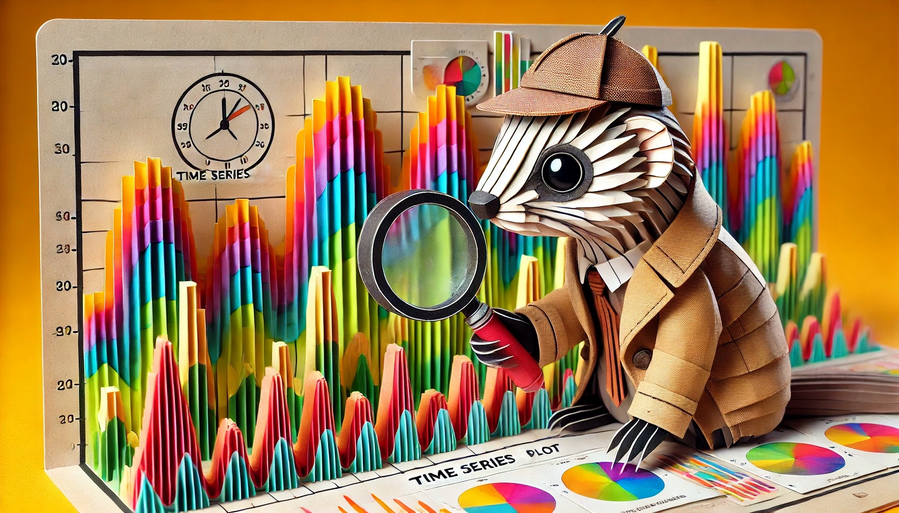
Romeo, Juliet & The Time Series Plot Mystery |
|
|
Good Monday Morning Ingo
I have been confounded a lot lately about the mystery of why a time series plot seems so more approachable than other graphs. |
The Plot Thickens: The magic that happens when Time Series are used of over Tables |
I started thinking about this when I attended a board meeting of a nonprofit a couple of weeks ago. After a long day, and certainly not when people were at their best cognition, the financial controller of the organization made a presentation of the state of financials.
Now, I've attended many meetings like this in my life, and seen financial people with wildly different presentational skills showcase the state of the organizational financials to a broad audience.
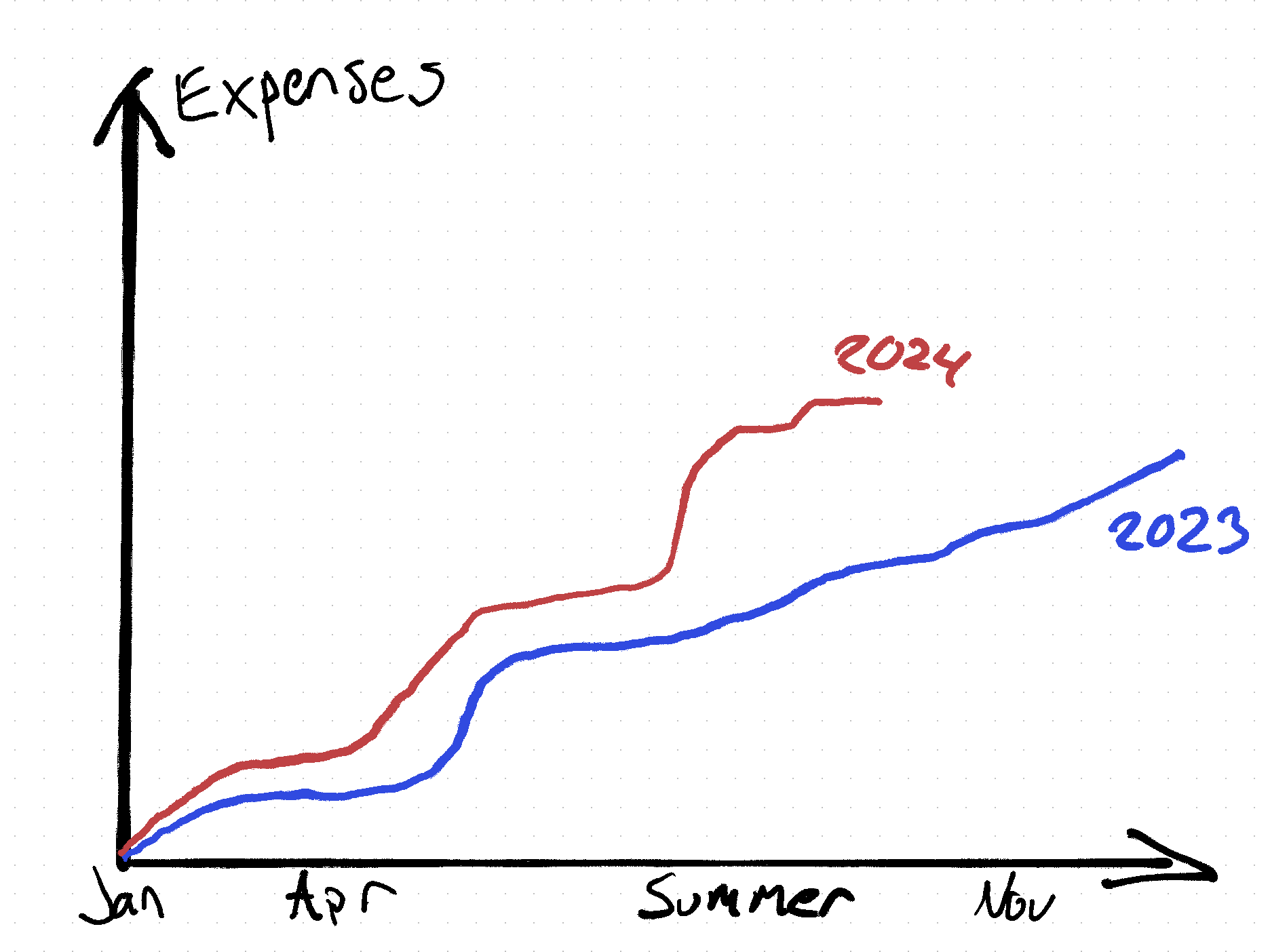
This particular one was interesting, as it was made almost completely without tabular data - their presentation was made almost entirely of time series graphs - showing liquidity over time, income over time, debt over time, assets over time, and all of them were shown with the prior year or years side by side. Instead of showing tables of numbers, all slides all looked sort of like this. |
| |
The same was done for liquidity, inflow etc. All time series. Peculiar. Impressive.
|
A Time Series Plot is a Resonating Classic |
While I thought the presentation was very good, but didn't think of it as special until afterwards. Many of the attendees (who are not at all of financial or data background) remarked on how good the presentation was and how easy it was to understand. "Wow it was so simple to understand this financial presentation" is a remark one rarely hears, so my curiosity was piqued. Since you are probably wondering, it should also be noted in this context that this organization doesn't have one of those "everything is amazing and positive" cultures. Compliments are rarely given as motivation, as the organization is rather egoless - if a positive remark is made, it is almost made from a point of truth (as opposed to the common situation where there is an additional, the ulterior motive to make the recipient feed good or work harder) It struck me that this particular type of graph - a time series plot with a baseline - seems to be more intuitively understandable than other graphs to non-statisticians. I always hesitate to use the word "natural", but it's hard not to reach for it here. |
Why is a Time Series Plot more accessible than other graphs? |
I think this is worth paying some attention to, because given that the vast majority of people aren't (and will never be) statisticians, finding ways of communicating data to non-statisticians is critical if we want a world with decisions based on data.
So I went down a little rabbit hole of trying to point a bit more why this is. It's not just because it's a plot with data points, there are plenty of plots that people don't express being naturally graspable. I began by searching around for how teachers explain these concepts to kids.
I started with that because I figured that explanations to kids would have to rely on more real world and/or basic analogies and our primal intuition to a larger degree than explanations made to adults.
I started out looking at algebra lessons for kids, but that line of research made it obvious that algebra is still a concept that most humans associate with death and despair. If we want to communicate data in a broadly accessible way, it should require no algebraic skills to parse. Moving down into a less general concept, I searched for "plots for kids".
I quickly found a video that explained plots as "a sequence of events that describes what happens in a story and why it happens". My first thought was that this definition was incorrect, or at least incomplete, because plots are not necessarily a time series. But then I realized that, in my clicking around in many tabs, I had started watching a video NOT on the subject of math, but one of reading comprehension. This was a video was teaching kids about the narrative arc. 🤣🤦♂️ |
As some of you may know, my original schooling is theatre and TV, and it's only later in life I picked up programming and data engineering, which is what makes software development terms like "script" and "user story" more complex to me than most,
Nowow that I am getting into data some of these things explode in my brain through very old connections - this was the first time I REALLY understood how the concepts of a plot line and a line plot are actually related. |
|
|
The term plot has its origins from the old English word "plot" that meant "a small piece of ground" or "a plan or scheme" and was originally related mostly to drawing points on a map.
By the 16th century, the term had evolved to describe the sequence of events or the "scheme" of a story, and Shakespeare and his contemporaries were using this terminology to refer to how they structured story. The mathematical use started 200-300 years later. |
For those of you that are unfamiliar with the academic side of narrative storytelling, a plot refers to the sequence of events that make up the story. It's the structured framework that outlines how the story unfolds, guiding the reader or audience through the beginning, middle, and end. The plot is what gives the story its shape, driving the action forward and providing a sense of direction and purpose. |
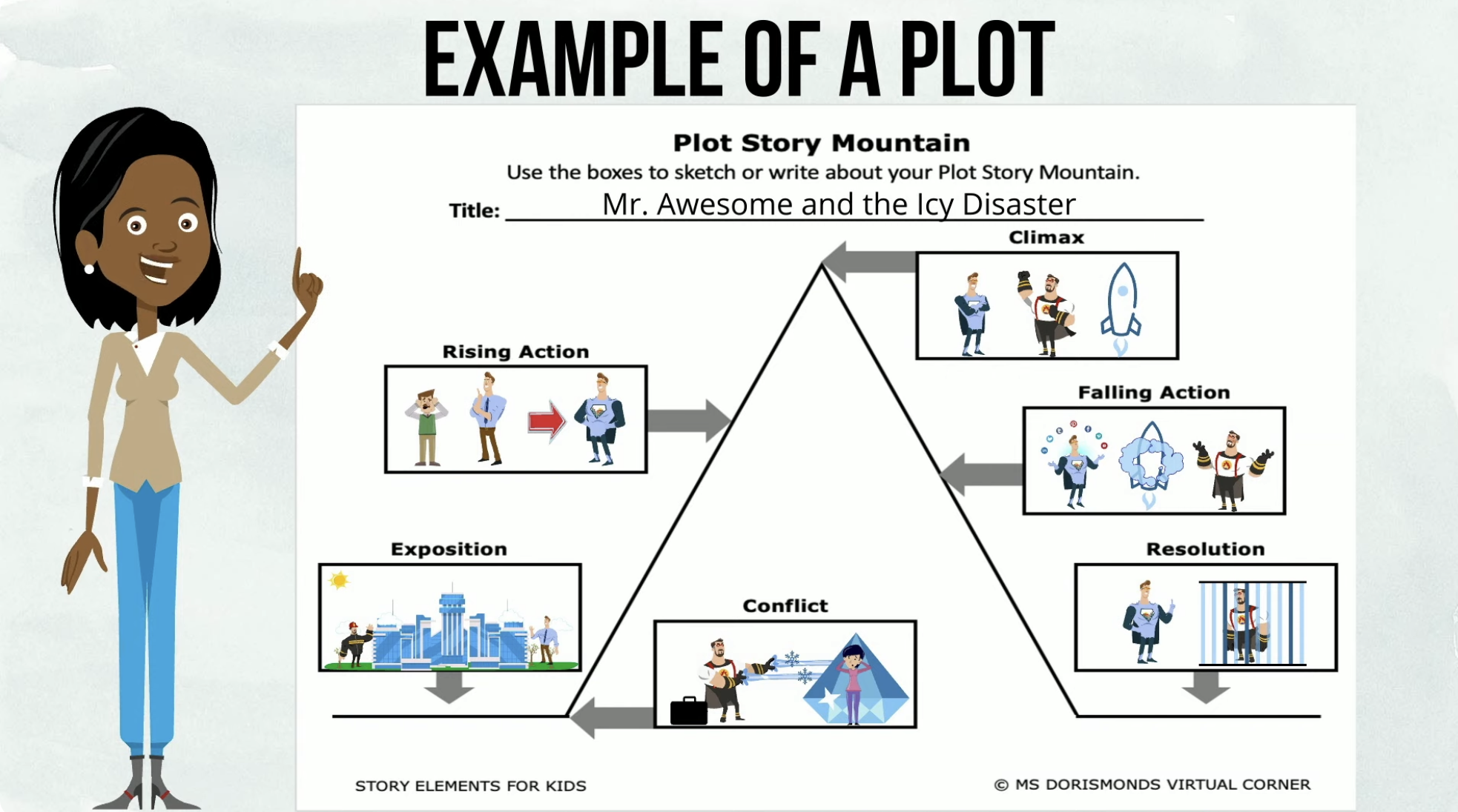
It's not super important to understand the elements of a plot, but if you are curious, below are the key elements, so that you don't have to leave the reading flow of this article:
Exposition: This is the introduction, where the setting, characters, and basic situation are established. It sets the stage for the story and provides the necessary background information. Rising Action: A series of events that create tension and build toward the story's climax. These events complicate the situation, introduce conflicts, and develop the characters.
Climax: The most intense, exciting, or important point of the story. It's the turning point where the main character faces the central conflict and must make a critical decision or take decisive action. Falling Action: The events that follow the climax, where the story starts to wind down. The conflicts begin to resolve, and the consequences of the climax play out.
Resolution (or Denouement): The final part of the plot, where the story's conflicts are fully resolved, and the narrative comes to a satisfying conclusion. Loose ends are tied up, and the characters' fates are revealed. |
Not all stories follow precisely this structure, but it is remarkably universal - from MacBeth to Jurassic Park. As a young creative soul in my teens, it was one of the most frustrating things I've ever learned that pretty much all stories follow a universal pattern. Whenever an author has tried to deviate too much from this, audiences have not taken to it, and it is still fascinating to me how this transcends cultures and history.
For example, the story of Romeo and Juliet has had at least 45 feature film adaptations (and many more that subtly allude to it). The only IP that gets close to that are James Bond and Godzilla. A good story is a very resilient thing. That said, what we are talking about here is not Story, but Plot, which is a distinct thing.
Plot: Refers to the specific sequence of events and actions within a narrative. It focuses on how the story is told, including the order of events and the cause-and-effect relationships between them.
Story: Refers to the broader concept of what happens in the narrative, encompassing all events, characters, and settings, whether or not they are explicitly detailed in the plot.
For example, in Shakespeare's Romeo and Juliet (that has had at least 45 feature film adaptations), The story is about two young lovers from feuding families. The plot includes the specific sequence of events: the meeting at the ball, the secret marriage, the conflict with Romeos rival Tybalt, the misunderstandings, and the tragic deaths. |
In the context of data analytics, a plot is a visual representation of data points on a coordinate system. It is a fundamental tool used to reveal patterns, trends, correlations, and other insights from a dataset.
Sidenote: Note that a Plot and Graph are not the same thing - all plots are graphs but not all graphs are plots, they can include more complex structures, such as network graphs, which show relationships between nodes, or function graphs, which depict mathematical functions. |
The concept of a plot in both data and storytelling shares a fundamental purpose: to convey information in a structured, meaningful way that reveals relationships, patterns, or narratives.
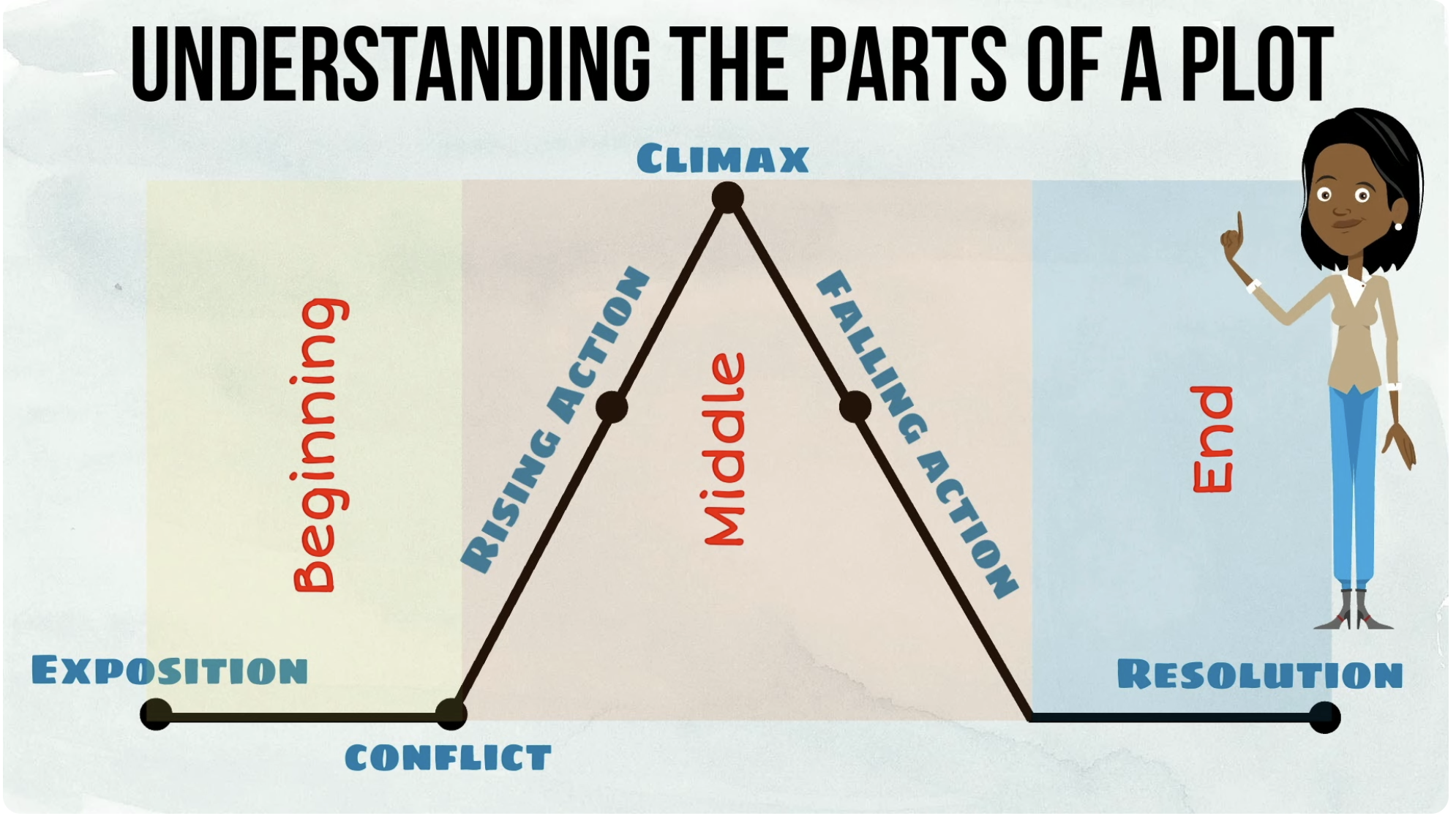
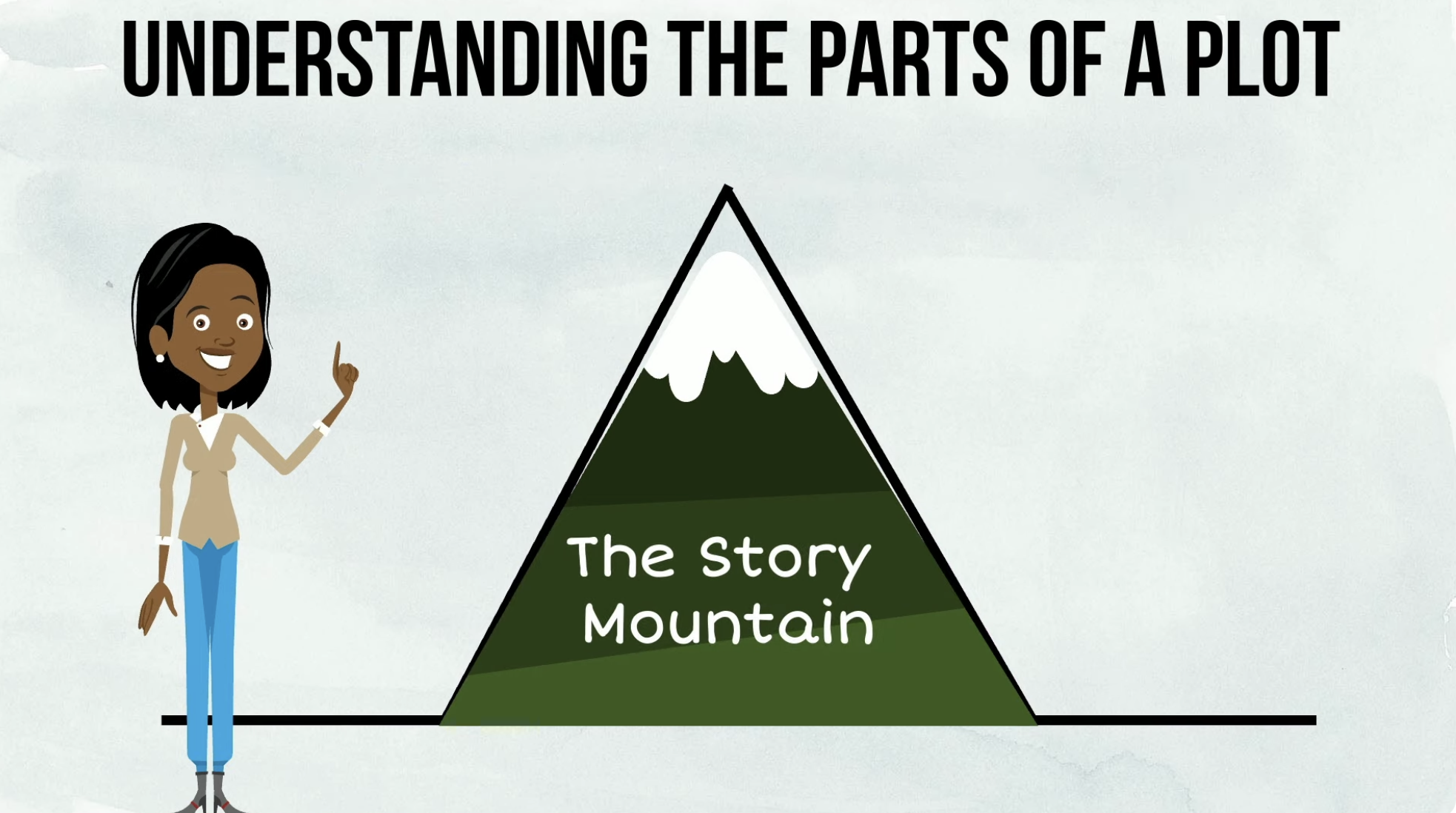
In a narrative arc, the x-axis typically represents time or the progression of events, while the y-axis maps dramatic tension, emotional intensity, or stakes in the story. As the plot unfolds, the tension or emotional stakes generally increase, peaking at the climax before resolving during the falling action and resolution.
What is fascinating to me is that a video that explains story structure to a kid will do it with a plot (with the added pedagogical analog to a mountain that the story/character climbs): |
From what I've gathered so far, it seems to me that time series are particularly easy to parse because describe the progression (story) of something over time.
But the original graphs in my example, also has another interesting trait, a baseline, which I think is relevant: |
When I say baseline, I mean "the thing we're comparing to", in the above visual the blue line. But instead of the 2023 line, we could imagine a yearly average, or industry average, something to relate the figures to. Absolute values are, when you think about it, a rather nonsensical concept. We always need relative points to compare to, like before/after Christ or above below freezing point.
In story mechanics, it is important to have a baseline arc that the audience can resort to, we want to know where in the structure we are, so that we know when the character is starting to falter in their development, and feel when suspense buildup is coming, and not having to relearn everything from scratch.
This is why we can make one billion Shakespeare remakes and it is still interesting to watch them, because as humans we are very interested in story deviations. We know how the story usually goes, and we are looking for interesting detours. Even if you have seen MacBeth 40 times, and probably especially then, Kathryn Hunters interpretation of the witches will strike you quite a bit: |
If you know MacBeth, seething Kathryn in the role is cool as hell. But if you have no prior relation with MacBeth at all, it will have significantly less meaning to you as you lack a baseline - one would probably find it nifty at best, but probably just a weird black and white movie with strange old language. Maybe... it would feel like if I removed the baseline from the previous graph? Like this? |
For me, losing the baseline feels viscerally different. I'm not sure if it is because I am that much of a data guy now, but I feel the difference in my body - it's not purely an intellectual experience.
Adding absolute numbers to the scale would not really help us, because we don't know the history, so we have no idea if this is good or not. However, with the baseline in place, there is a story. We still saw the jump as the start of the summer in the baseline-less graph, but with the baseline, we get REALLY curious what happened: |
I'm a Postgres guy, it's a very robust and good choice for app storage that it hard to beat. But hosting Postgres has NOT been the lovely part of using it, historically.
That is why Neon has been on my (actual) wishlist of sponsors since the early days of reboot of Fun Fun Function, and it has finally happened! 🥳 Neon is now an official sponsor of Fun Fun Function - please check them out via fff.dev/neon if you want to show that you came from here.
Neon is what backs fff.dev and is since some time back my personal goto for Serverless Postgres these days, whenever I need a database for an app it's what I use. It is VERY important for me with a good freemium tier for anything I recommend - Neon is free for all my little dinky side projects and prototypes, and autoscales up to huge loads for my professional work.
Neon also allows you to work with databases with branching, i.e. the same way you work with code (which is the reasonable, yet uncommon, way to to do it). Overall, their philosophy to serverless postgres is really sound, and their original SELECT 'Hello World' blog post when they announced themselves to the world is a good read on the way Neon thinks about Postgres hosting.
Thank you so for sponsoring Fun Fun Function, Neon! |
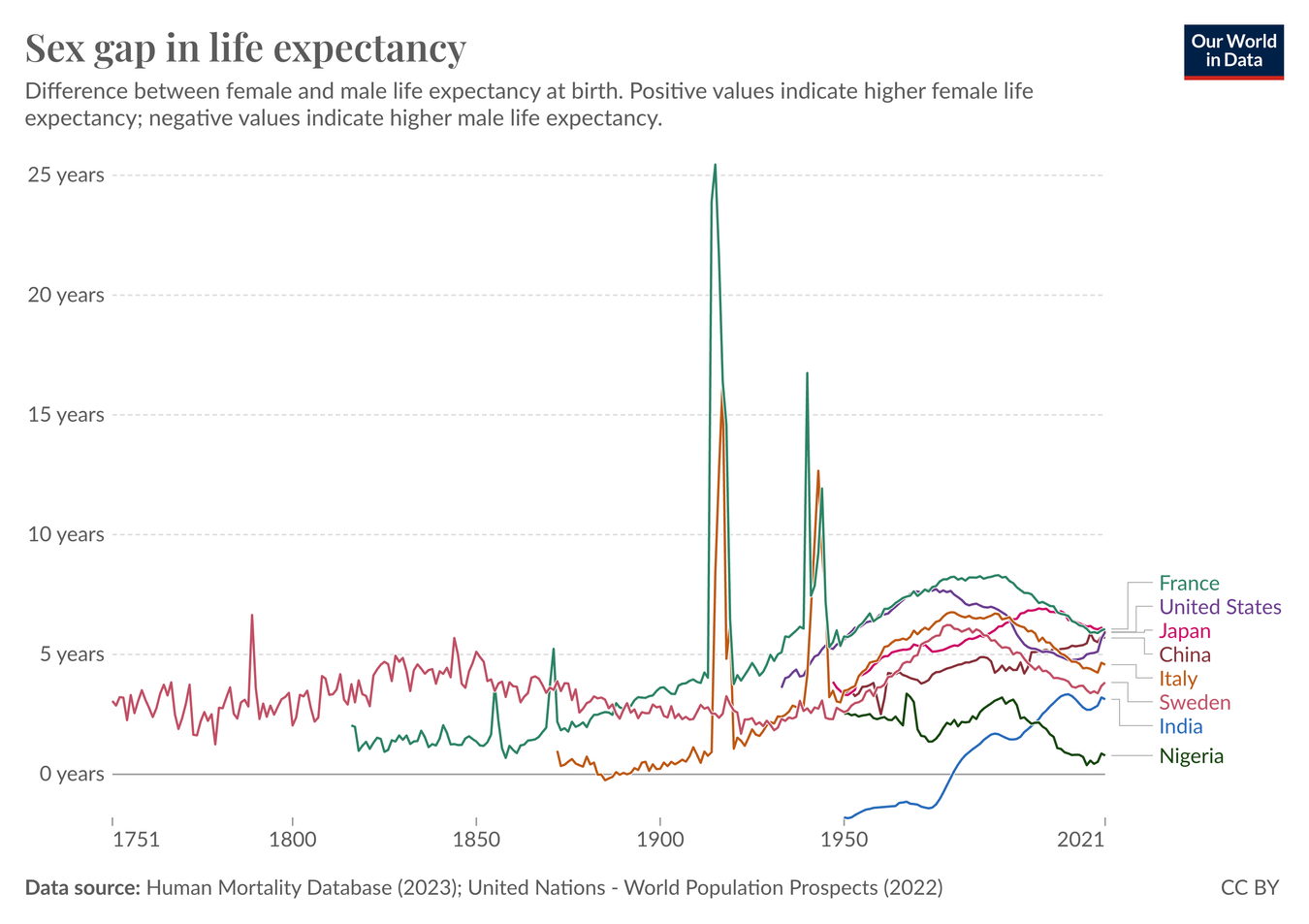
The sex gap in life expectancy has changed over time |
One ambition that I've had for a long time but has been a bit lazy in manifesting is to regularly highlight some cool data visualizations or data sets. Please do send them in if you come across some (just hit reply to this email, it goes directly to me).
For this week, I found this nugget: The sex gap in life expectancy has changed over time. |
I think about the sex gap in life expectancy a lot. Ever since a kid, I was aware of it, but I had just assumed that it was a fixed, biological thing and it wasn't until in my early 30ies when I read I Don't Want to Talk About It: Overcoming the Secret Legacy of Male Depression that I learned that the gap is completely behavioral.
It is very nice news to see this gap narrowing - men are taking care of themselves better. One big reason being that men smoke less, it seems, which is poetic given that I'm cigarette free myself nowadays. 🦾
Finally, a reminder to give Neon a whirl for your next database, it is such a lovely tool: fff.dev/neon |
|
|
Be a light, not a judge. Be a model, not a critic. MPJ |
| |
|
©2024 Fun Fun Function AB
Mailing Address:
Kund-id WIN9417, FE nr 160
105 69 Stockholm
|
|
|
|


_01J670F33YMBDGBY5M3JK2HF1Q.png)